Due to the EID vacation, our team will be out of the office from June 14th to 22nd. During this time, our support response times may be slightly delayed, but some of our support heroes will do their best to assist. Rest assured, we'll be back to full speed on June 23rd.

Table of contents:

See more

Duplicate a page in Webflow is straightforward and can streamline your
Webflow website management and design tasks. Whether you're looking to replicate a page's layout for a new section or experiment with different content without altering the original, this feature simplifies the process. 

This guide will walk you through the easy steps on how to duplicate a page in Webflow. These steps ensure you can manage and customize your Webflow site with minimal effort.

Key Takeaways

  1. Duplicating a page saves time by replicating existing layouts and structures quickly.
  2. Ensures a uniform design and layout, maintaining a cohesive look and feel throughout your website.
  3. It allows you to experiment with different content or designs without altering the original page.
  4. Reduces the effort required to set up similar pages, improving workflow efficiency and site management.
  5. Discover efficient methods to streamline your workflow, saving time and effort in your web projects.

30+ Top-notch Webflow Templates

Take your website design to the next level with our stunning collection of Webflow templates. making them more manageable

Why Change the Button Hover Color?

Changing the hover color of the button can significantly impact the user experience and website design. Here are three reasons why:

Enhance User Experience

A hover effect provides users with feedback, indicating the button is interactive. It improves navigation and makes the site more intuitive.

Improve Visual Design

A color change on hover creates a more dynamic and engaging visual experience. It draws attention to important elements, enhancing overall design aesthetics.

Encourage Action

Changing the hover color subtly prompts users to click, increasing conversions. It also makes the call to action more appealing and noticeable.

Understanding Webflow’s Button States

Webflow offers versatile options for styling buttons enhancing user interaction and design. Buttons are crucial elements for guiding users to take action, whether submitting a form or navigating to another page.

With Webflow, you can customize buttons to match your brand's aesthetics, including size, color, text, and hover effects. This feature makes them more interactive and visually appealing. By leveraging Webflow’s flexible styling options, you can create buttons that improve user experience and conversions.

Step-by-Step Guide to Changing Button Hover Color in Webflow

Step 1: Open Your Webflow Project
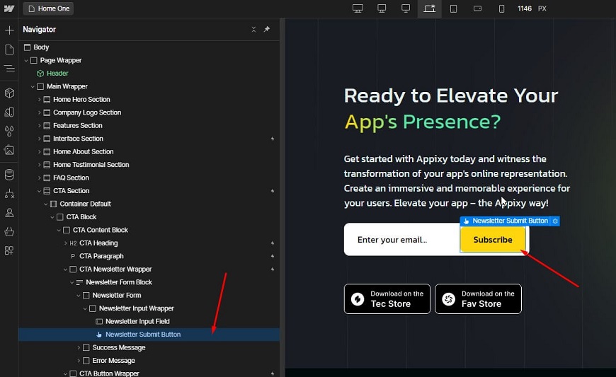
Open Your Webflow Project

Start by opening your Webflow dashboard and selecting the project you want to edit.

Step 2: Select the Button
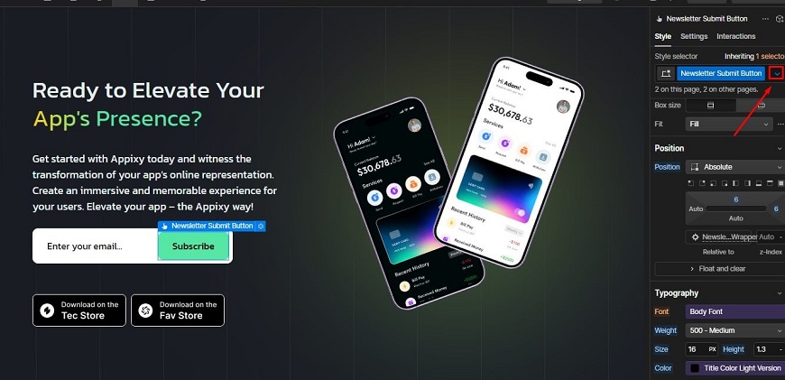
Select the Button

Click on the button element you want to customize within your project’s design.
button element

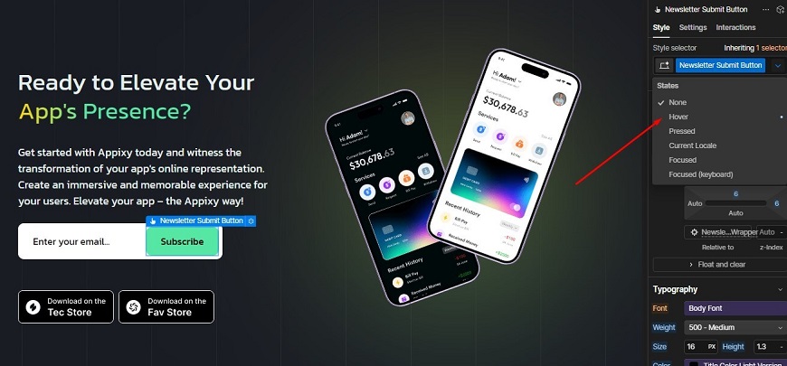
Step 3: Navigate to the States Dropdown

Navigate to the States Dropdown

In the Style Panel, find the "States" dropdown and select "Hover" to apply hover-specific styling.

Step 4: Change the Hover Color
Change the Hover Color

Under the background color button settings, choose the new color you want for the button hover state.

Step 5: Customize Other Hover Effects (Optional)
Customize Other Hover Effects (Optional)

You can further enhance the button by adjusting:

  1. Text color: Change the color of the button text when hovered.
  2. Border color: Adjust the border color to match or contrast with the hover.
  3. Box shadow: Add shadow effects to create depth when hovering.
  4. Transition effects: Apply smooth transitions for hover effects to create a polished experience.

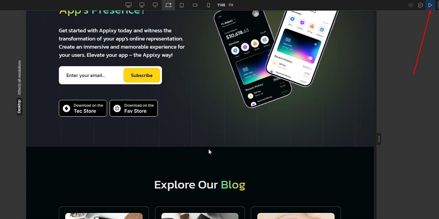
Step 6: Preview the Changes

Use Webflow’s preview option to see how your hover effects look in real-time.

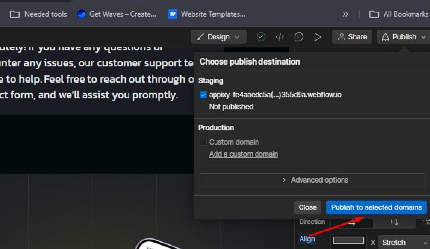
Step 7: Publish the Changes

Once satisfied, publish the changes and apply them to your live website.

Best Practices for Choosing Hover Colors

When selecting webflow button hover colors for your website, it is essential to follow best practices that enhance user experience and maintain visual consistency.

1. Use Contrast

Choose hover colors that clearly contrast with the default button color. This ensures the button stands out when interacted with, improving usability and drawing attention to key elements.

2. Stick to Your Brand Colors

Always align hover colors with your brand's color palette. This keeps your design consistent and reinforces brand identity while ensuring the hover effect feels natural to your webflow website.

3. Keep Accessibility in Mind

Ensure your hover color choices meet accessibility standards, especially for visually impaired users. Choose easily distinguishable colors and maintain good readability for a more inclusive user experience.

4. Add Subtle Animations

When a hover effect is triggered, incorporate smooth, subtle animations. This adds an extra layer of interactivity, enhancing user engagement without overwhelming them visually.

Customizing Hover Effects for Multiple Buttons

To streamline the process of customizing hover effects for multiple buttons on your website, follow these simple steps:

Step 1: Assign a Class to Your Button

Begin by assigning a unique class to the button you wish to style. This ensures all buttons with the same class will share identical hover effects, making design management easier.

Step 2: Apply Hover Styles to the Class

Once the class is assigned, navigate to the hover state in your design tool. Here, apply your desired hover styles, such as changing the background or text color or adding a shadow.

Step 3: Modify the Hover State for the Class

Customize additional hover states like transitions, border effects, or animations. These will automatically apply to every button with the same class, ensuring consistency across your website. 

Troubleshooting Common Issues

1. Hover Effect Not Showing

If your hover effect isn't displaying, ensure you've applied the hover style to the correct button class. Double-check if the "States" dropdown is set to "Hover" when customizing the button’s appearance.

2. Inconsistent Hover Colors

Inconsistent hover colors may arise if multiple button classes have different hover settings. To fix this, ensure that all buttons share the same class or hover styles for consistency across your webflow site.

30+ Top-notch Webflow Templates

Take your website design to the next level with our stunning collection of Webflow templates. making them more manageable

Bonus: Some Popular Webflow Template That Used Hover Effects

Realvy - Real Estate Website Template

Realvy - Real Estate Website Template

Realvy is a versatile real estate Webflow template, perfect for real estate agencies and property listings. It features sleek hover effects on property images, revealing detailed information instantly. Customizable layouts and built-in eCommerce functionality enhance user interaction and engagement effectively.

Arfito - Consulting Website Template

Arfito - Consulting Website Template

Arfito offers a dynamic platform for business consulting, IT, and tech consultants. This template has 17 customizable pages, such as two home pages, a service page, a team page, etc. The hover effects on service icons highlight additional details, enhancing user navigation seamlessly. Its creative, SEO-optimized design ensures a professional online presence with ease.

Mailbes - SaaS Website Template

Mailbes - SaaS Website Template

Mailbes is designed for startups, SaaS, and software companies that focus on email marketing. This template has a hover effect on the call-to-action button. The Hover animations on call-to-action buttons stand out, effortlessly attracting user interaction. Its sleek, customizable design makes launching digital products a breeze.

TechCraze - Small Business Website Template

TechCraze - Small Business Website Template

TechCraze is ideal for IT agencies, startups, and SaaS companies needing a professional website. Hover effects on portfolio items provide quick previews, enhancing browsing experiences. The modern design and customizable features suit various tech business needs.

Finteck - Finance Website Template

Finteck - Finance Website Template

Finteck is versatile for finance, banking, and investment businesses seeking an online presence. Interactive hover effects on financial tools provide instant insights to users. This customizable template is user-friendly, ensuring a hassle-free experience.

Frequently Asked Questions

1. Can I apply different hover effects to different buttons?

Yes, you can apply different hover effects to each button by using unique CSS classes or IDs for customization. This allows you to tailor the appearance and interaction of each button individually, enhancing the user experience with distinct visual cues.

2. How can I make my hover effect smoother?

To make hover effects smoother, use CSS transitions to gradually change properties like color, size, or position. Specify the transition duration and timing function to control the speed and easing, creating a polished and fluid user interaction.

3. Is it possible to add animations to the hover effect?

Yes, you can add animations to the hover effect in Webflow easily. Use the Transition settings in the Style panel to create smooth animations. This improves the overall user experience and makes your buttons stand out on your website.

4. Can I change the hover effect for multiple buttons at once?

Yes, Webflow allows you to change hover effects for multiple buttons using classes. Assign the same class to the buttons you want to customize. Apply hover styles to the class, and Webflow will automatically apply the changes to all assigned buttons.

5. How do I test the hover effect on mobile devices?

To test hover effects on mobile, use Webflow's responsive design preview feature. This lets you switch between device views to see how the hover effects work. Hover effects may behave differently on mobile, so previewing ensures proper functionality.

Conclusion

In conclusion, changing the hover color of the button in Webflow is easy and effective. It improves your website’s user experience, design, and engagement with minimal effort. By following simple steps, you can quickly customize hover effects to match your brand. These changes will make your Webflow site more interactive and visually appealing.

Reader Disclosure: Some of the posts on our site may contain affiliate links. Clicking may earn us a commission at no extra cost to you. Thank you for your support! Read our Disclosure

Table of content:

See more

Duplicate a page in Webflow is straightforward and can streamline your
Webflow website management and design tasks. Whether you're looking to replicate a page's layout for a new section or experiment with different content without altering the original, this feature simplifies the process. 

This guide will walk you through the easy steps on how to duplicate a page in Webflow. These steps ensure you can manage and customize your Webflow site with minimal effort.

Key Takeaways

  1. Duplicating a page saves time by replicating existing layouts and structures quickly.
  2. Ensures a uniform design and layout, maintaining a cohesive look and feel throughout your website.
  3. It allows you to experiment with different content or designs without altering the original page.
  4. Reduces the effort required to set up similar pages, improving workflow efficiency and site management.
  5. Discover efficient methods to streamline your workflow, saving time and effort in your web projects.

30+ Top-notch Webflow Templates

Take your website design to the next level with our stunning collection of Webflow templates. making them more manageable

Why Change the Button Hover Color?

Changing the hover color of the button can significantly impact the user experience and website design. Here are three reasons why:

Enhance User Experience

A hover effect provides users with feedback, indicating the button is interactive. It improves navigation and makes the site more intuitive.

Improve Visual Design

A color change on hover creates a more dynamic and engaging visual experience. It draws attention to important elements, enhancing overall design aesthetics.

Encourage Action

Changing the hover color subtly prompts users to click, increasing conversions. It also makes the call to action more appealing and noticeable.

Understanding Webflow’s Button States

Webflow offers versatile options for styling buttons enhancing user interaction and design. Buttons are crucial elements for guiding users to take action, whether submitting a form or navigating to another page.

With Webflow, you can customize buttons to match your brand's aesthetics, including size, color, text, and hover effects. This feature makes them more interactive and visually appealing. By leveraging Webflow’s flexible styling options, you can create buttons that improve user experience and conversions.

Step-by-Step Guide to Changing Button Hover Color in Webflow

Step 1: Open Your Webflow Project

Open Your Webflow Project

Start by opening your Webflow dashboard and selecting the project you want to edit.

Step 2: Select the Button

Select the Button

Click on the button element you want to customize within your project’s design.

button element

Step 3: Navigate to the States Dropdown

Navigate to the States Dropdown

In the Style Panel, find the "States" dropdown and select "Hover" to apply hover-specific styling.

Step 4: Change the Hover Color

Change the Hover Color

Under the background color button settings, choose the new color you want for the button hover state.

Step 5: Customize Other Hover Effects (Optional)

Customize Other Hover Effects (Optional)

You can further enhance the button by adjusting:

  1. Text color: Change the color of the button text when hovered.
  2. Border color: Adjust the border color to match or contrast with the hover.
  3. Box shadow: Add shadow effects to create depth when hovering.
  4. Transition effects: Apply smooth transitions for hover effects to create a polished experience.

Step 6: Preview the Changes

Use Webflow’s preview option to see how your hover effects look in real-time.

Step 7: Publish the Changes

Once satisfied, publish the changes and apply them to your live website.

Best Practices for Choosing Hover Colors

When selecting webflow button hover colors for your website, it is essential to follow best practices that enhance user experience and maintain visual consistency.

1. Use Contrast

Choose hover colors that clearly contrast with the default button color. This ensures the button stands out when interacted with, improving usability and drawing attention to key elements.

2. Stick to Your Brand Colors

Always align hover colors with your brand's color palette. This keeps your design consistent and reinforces brand identity while ensuring the hover effect feels natural to your webflow website.

3. Keep Accessibility in Mind

Ensure your hover color choices meet accessibility standards, especially for visually impaired users. Choose easily distinguishable colors and maintain good readability for a more inclusive user experience.

4. Add Subtle Animations

When a hover effect is triggered, incorporate smooth, subtle animations. This adds an extra layer of interactivity, enhancing user engagement without overwhelming them visually.

Customizing Hover Effects for Multiple Buttons

To streamline the process of customizing hover effects for multiple buttons on your website, follow these simple steps:

Step 1: Assign a Class to Your Button

Begin by assigning a unique class to the button you wish to style. This ensures all buttons with the same class will share identical hover effects, making design management easier.

Step 2: Apply Hover Styles to the Class

Once the class is assigned, navigate to the hover state in your design tool. Here, apply your desired hover styles, such as changing the background or text color or adding a shadow.

Step 3: Modify the Hover State for the Class

Customize additional hover states like transitions, border effects, or animations. These will automatically apply to every button with the same class, ensuring consistency across your website. 

Troubleshooting Common Issues

1. Hover Effect Not Showing

If your hover effect isn't displaying, ensure you've applied the hover style to the correct button class. Double-check if the "States" dropdown is set to "Hover" when customizing the button’s appearance.

2. Inconsistent Hover Colors

Inconsistent hover colors may arise if multiple button classes have different hover settings. To fix this, ensure that all buttons share the same class or hover styles for consistency across your webflow site.

Bonus: Some Popular Webflow Template That Used Hover Effects

Realvy - Real Estate Website Template

Realvy - Real Estate Website Template

Realvy is a versatile real estate Webflow template, perfect for real estate agencies and property listings. It features sleek hover effects on property images, revealing detailed information instantly. Customizable layouts and built-in eCommerce functionality enhance user interaction and engagement effectively.

Arfito - Consulting Website Template

Arfito - Consulting Website Template

Arfito offers a dynamic platform for business consulting, IT, and tech consultants. This template has 17 customizable pages, such as two home pages, a service page, a team page, etc. The hover effects on service icons highlight additional details, enhancing user navigation seamlessly. Its creative, SEO-optimized design ensures a professional online presence with ease.

Mailbes - SaaS Website Template

Mailbes - SaaS Website Template

Mailbes is designed for startups, SaaS, and software companies that focus on email marketing. This template has a hover effect on the call-to-action button. The Hover animations on call-to-action buttons stand out, effortlessly attracting user interaction. Its sleek, customizable design makes launching digital products a breeze.

TechCraze - Small Business Website Template

TechCraze - Small Business Website Template

TechCraze is ideal for IT agencies, startups, and SaaS companies needing a professional website. Hover effects on portfolio items provide quick previews, enhancing browsing experiences. The modern design and customizable features suit various tech business needs.

Finteck - Finance Website Template

Finteck - Finance Website Template

Finteck is versatile for finance, banking, and investment businesses seeking an online presence. Interactive hover effects on financial tools provide instant insights to users. This customizable template is user-friendly, ensuring a hassle-free experience.

Frequently Asked Questions

1. Can I apply different hover effects to different buttons?

Yes, you can apply different hover effects to each button by using unique CSS classes or IDs for customization. This allows you to tailor the appearance and interaction of each button individually, enhancing the user experience with distinct visual cues.

2. How can I make my hover effect smoother?

To make hover effects smoother, use CSS transitions to gradually change properties like color, size, or position. Specify the transition duration and timing function to control the speed and easing, creating a polished and fluid user interaction.

3. Is it possible to add animations to the hover effect?

Yes, you can add animations to the hover effect in Webflow easily. Use the Transition settings in the Style panel to create smooth animations. This improves the overall user experience and makes your buttons stand out on your website.

4. Can I change the hover effect for multiple buttons at once?

Yes, Webflow allows you to change hover effects for multiple buttons using classes. Assign the same class to the buttons you want to customize. Apply hover styles to the class, and Webflow will automatically apply the changes to all assigned buttons.

5. How do I test the hover effect on mobile devices?

To test hover effects on mobile, use Webflow's responsive design preview feature. This lets you switch between device views to see how the hover effects work. Hover effects may behave differently on mobile, so previewing ensures proper functionality.

Conclusion

In conclusion, changing the hover color of the button in Webflow is easy and effective. It improves your website’s user experience, design, and engagement with minimal effort. By following simple steps, you can quickly customize hover effects to match your brand. These changes will make your Webflow site more interactive and visually appealing.

Reader Disclosure: Some of the posts on our site may contain affiliate links. Clicking may earn us a commission at no extra cost to you. Thank you for your support! Read our Disclosure

Table of contents:-

See more

Duplicate a page in Webflow is straightforward and can streamline your
Webflow website management and design tasks. Whether you're looking to replicate a page's layout for a new section or experiment with different content without altering the original, this feature simplifies the process. 

This guide will walk you through the easy steps on how to duplicate a page in Webflow. These steps ensure you can manage and customize your Webflow site with minimal effort.

Key Takeaways

  1. Duplicating a page saves time by replicating existing layouts and structures quickly.
  2. Ensures a uniform design and layout, maintaining a cohesive look and feel throughout your website.
  3. It allows you to experiment with different content or designs without altering the original page.
  4. Reduces the effort required to set up similar pages, improving workflow efficiency and site management.
  5. Discover efficient methods to streamline your workflow, saving time and effort in your web projects.

Reader Disclosure: Some of the posts on our site may contain affiliate links. Clicking may earn us a commission at no extra cost to you. Thank you for your support! Read our Disclosure

Arrow Image