Masonry grids have been a popular layout choice among web designers. The Webflow Masonry Grid, in particular, offers a unique and flexible way to display content on a website. But how can you create this layout? Fear not. This blog post is here to guide you through the process step by step. The guide will cover everything from creating a collection list to designing the grid and adding interactions. By the end of this comprehensive guide, you'll be able to create an impressive Webflow Masonry Grid that will make your website stand out.
What is a Masonry Grid?
A Masonry Grid, or Masonry Layout, combines a traditional grid layout, typically in columns, with a masonry layout. Unlike standard grids where gaps are left after shorter items, in the masonry axis, items in the next row adjust to fill those gaps, creating an uneven but visually appealing arrangement.
This layout method is commonly used in web design to create dynamic and aesthetically pleasing arrangements of content or images, where items flow seamlessly to utilize available space efficiently.
Advantages of Using a Masonry Grid in Web Design
Using a Masonry Grid in web design offers several advantages:
Dynamic Layout: Masonry grids allow for a dynamic, fluid layout that adapts to the content's size, resulting in a visually engaging design.
Visual Appeal: The asymmetrical layout creates a more visually appealing and unique design, breaking away from rigid, traditional grid patterns.
Optimal Space Utilization: It efficiently utilizes available space, reducing wasted gaps and making the most of the screen real estate.
Responsive Design: Masonry grids are well-suited for responsive web design, as they naturally adjust to different screen sizes and orientations.
Enhanced User Experience: The dynamic arrangement of content can capture users' attention and improve the overall user experience, making content more engaging.
Showcasing Visual Content: It's ideal for visual content like images or products, allowing for diverse and creative displays.
How it Differs from Traditional Grid Layouts
Masonry Grids in Webflow depart from the rigidity of traditional grid layouts. In traditional grids, content is forced into fixed rows and columns, often resulting in uneven and wasted spaces, especially when dealing with items of various sizes.
On the other hand, Masonry Grids offers a more dynamic and visually engaging alternative. Elements in a Masonry grid in Webflow don't follow fixed dimensions. It naturally fits into available space. This creates an asymmetrical and harmonious layout.
The adaptive approach of the grid layout is particularly beneficial for content like images or products with diverse dimensions. Webflow Masonry Grids don't conform to uniformity, enabling designers to break free from traditional grid constraints. The result is an aesthetically appealing, user-friendly web design that captures attention and enhances the user experience.
30+ Top-notch Webflow Templates
Take your website design to the next level with our stunning collection of Webflow templates. making them more manageable
Overview of the Webflow Masonry Grid
The Webflow Masonry Grid is a layout design commonly used in web development to create visually appealing and flexible grids, particularly for image galleries or content displays.
Unlike traditional grid layouts with fixed rows and columns, the Masonry Grid accommodates content of various sizes and shapes. It handles portrait, landscape, or square images seamlessly, eliminating unnecessary gaps. This optimizes space utilization for a more versatile and visually appealing design.
It offers flexibility by allowing items of different sizes to align seamlessly along the edges, creating an aesthetically pleasing and adaptive design. This layout is especially useful when dealing with diverse content dimensions and is often associated with modern and dynamic web designs.
How to Create a Masonry Grid in Webflow
Here is a detailed step-by-step guide on how to create a masonry grid in Webflow:
Setting Up Your Webflow Project:
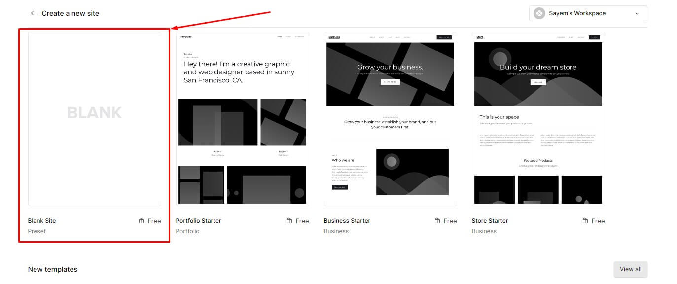
- Create a new Webflow project or open an existing one.
- Choose the desired page layout and add a new section to hold your masonry grid.
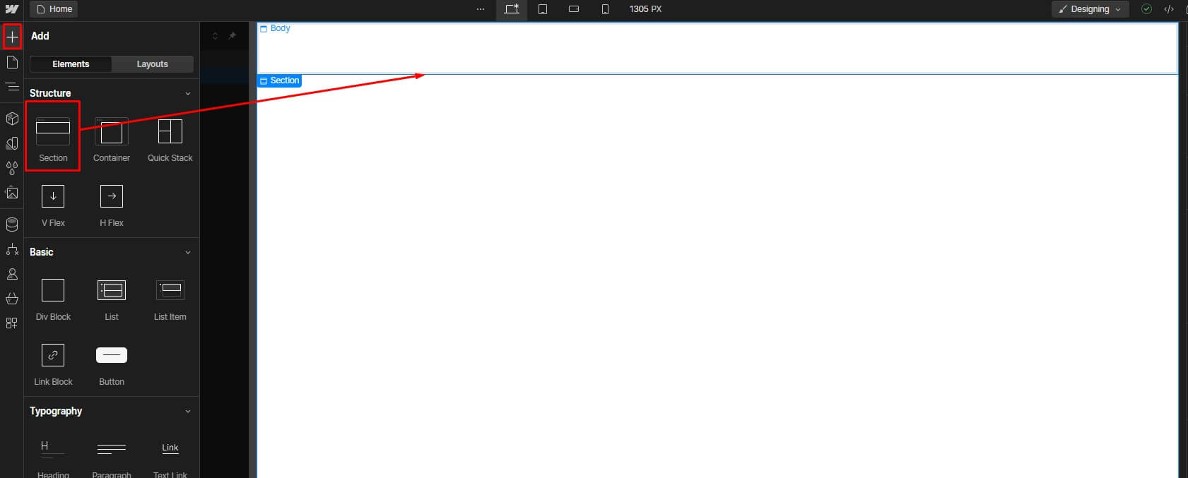
3. Drag and drop a "Section" element from the Add Panel onto your page.
Adding Elements to Your Project

- Within the "Section" element, add a "Div" element to contain the items in your masonry grid.
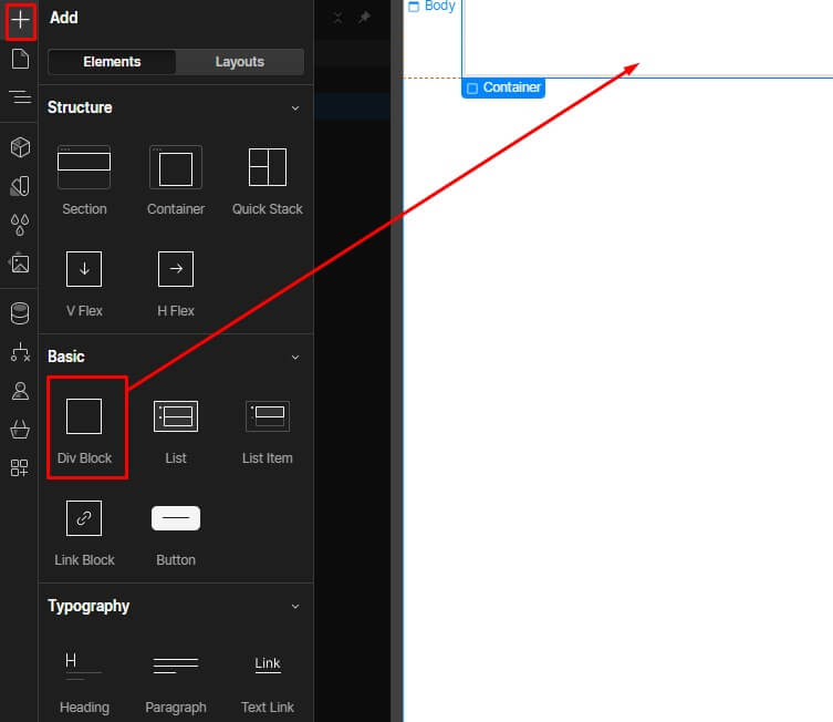
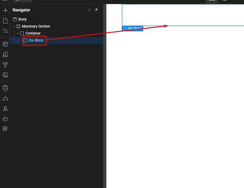
2. Drag and drop a "Div" element from the Add Panel onto your section.
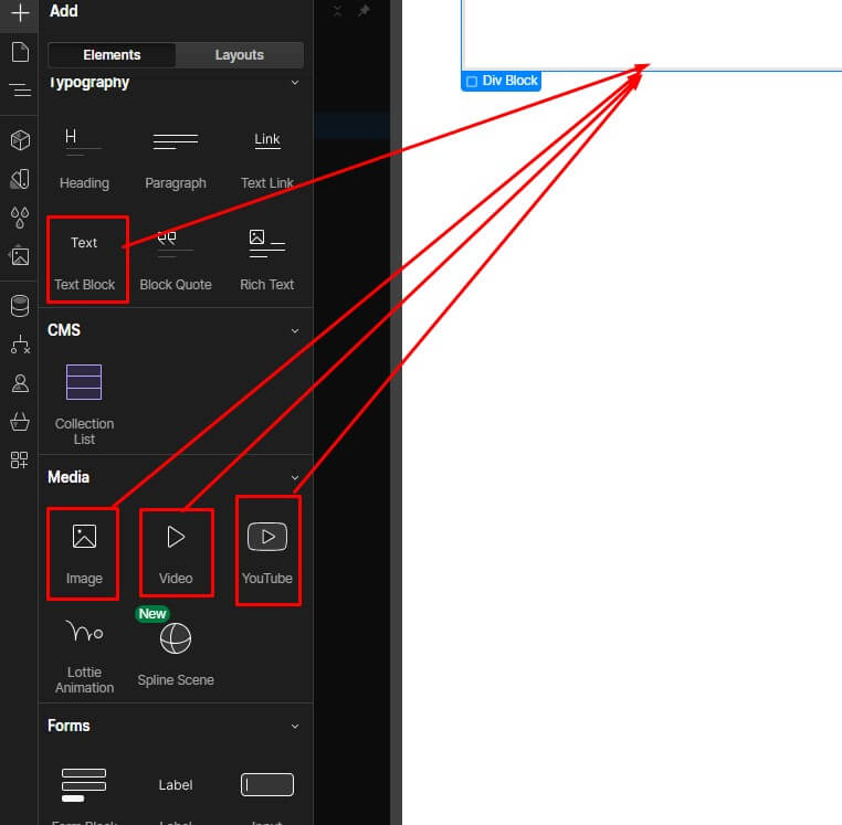
3. Inside the "Div" element, add the items you want to display in your masonry grid. These can be images, text blocks, videos, or any other type of content.
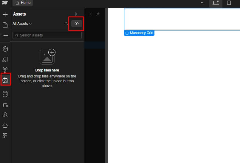
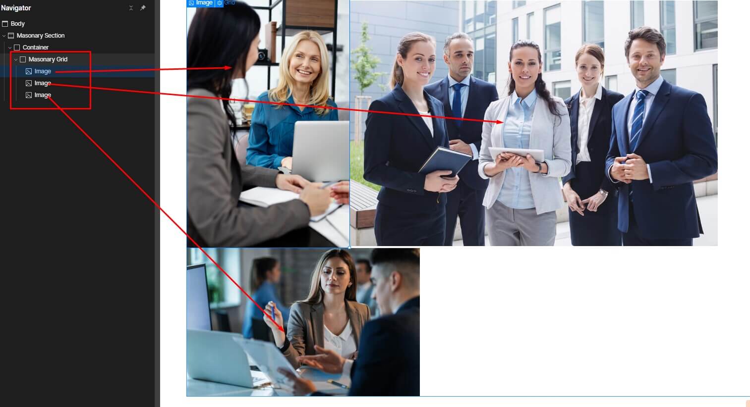
4. You can add images by dragging and dropping them from your computer or by using a URL to link to an image online.
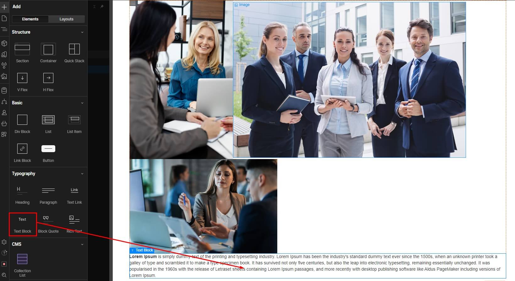
5. To add text blocks, click on the "Add Text" button in the Add Panel and type your desired content.
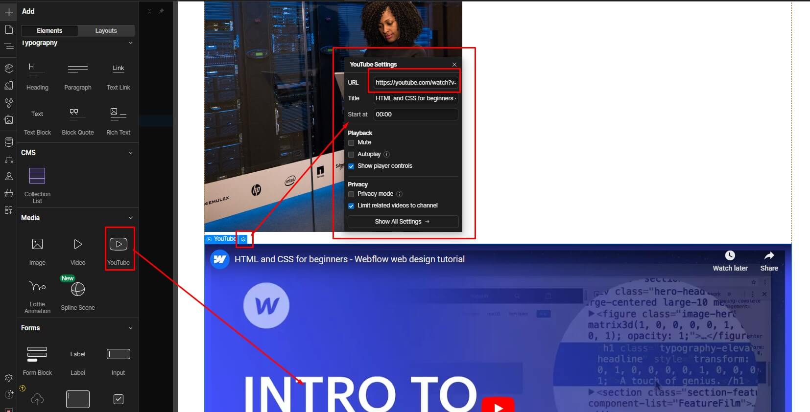
6. To embed videos, click on the "Embed" button in the Add Panel and paste the embed code from your video hosting platform.
Styling Your Grid:
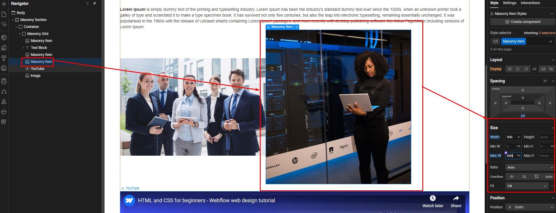
- Select the "Div" element that contains your items and open the Style Panel.
2. In the Layout section, set the "Gap" property to the desired spacing between the items in your grid.
3. You can also adjust the width of the "Div" element to control the overall width of your masonry grid.
4. Style the individual items in your grid as desired. You can adjust the width, height, and object-fit settings for images to ensure they fit proportionally within the grid container.
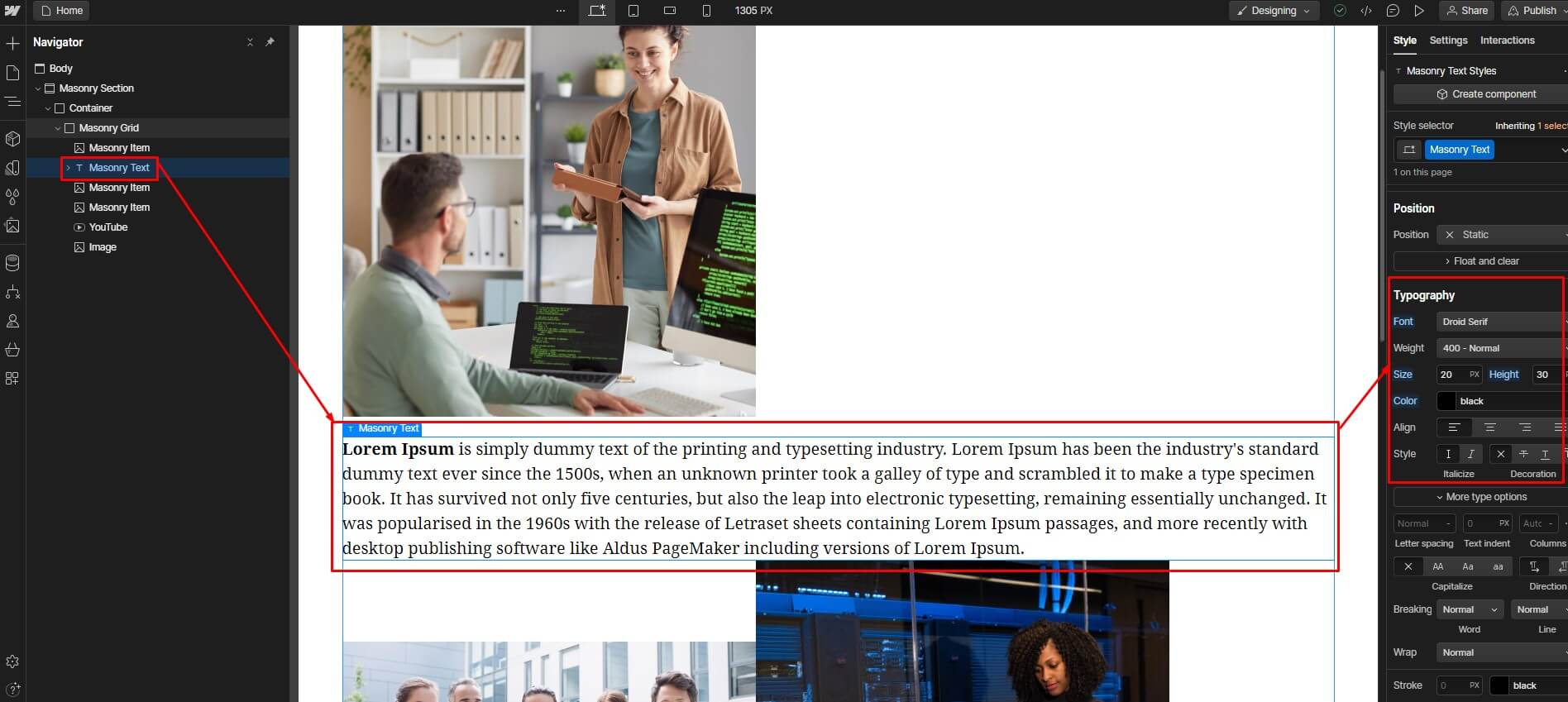
5. For text blocks, you can change the font size, color, and alignment.
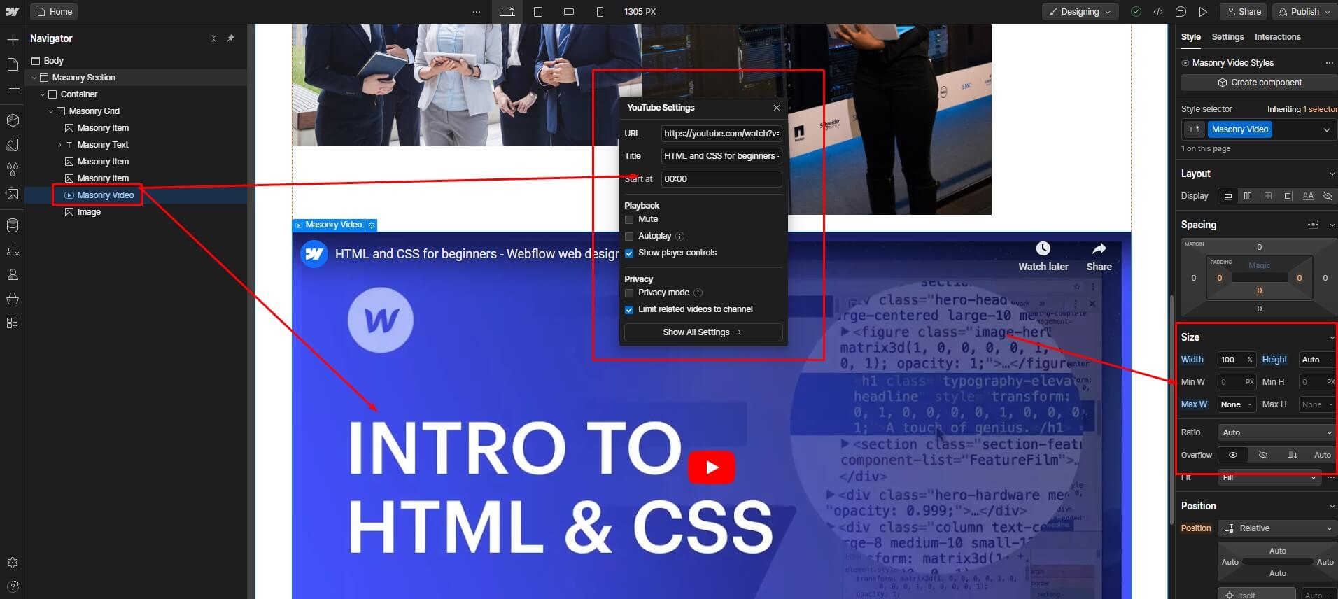
6. For videos, you can adjust the size and controls.
Enabling the Masonry Effect:
- To apply the masonry layout, open the Typography section in the Style Panel.
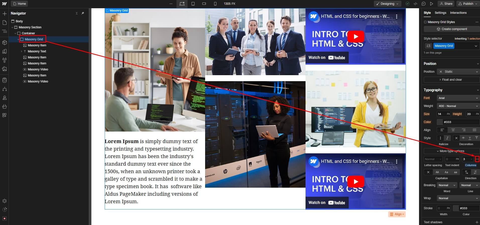
- Click on "More Options" button (the three dots) and select "Columns".
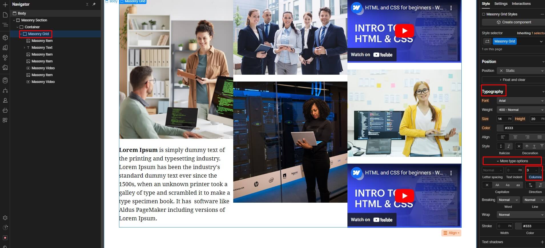
3. Enter the number of columns you want your grid to be divided into. This will determine how many items will appear in each row of the grid.
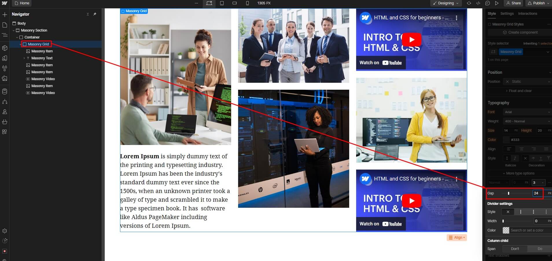
4. You can also adjust the "Column Gap" to control the spacing between the columns.
Ensuring Responsiveness:
- Webflow's responsive grid layout guarantees an appealing appearance on any device, irrespective of screen size.
- Webflow automatically adjusts the layout of your grid based on the viewport width.
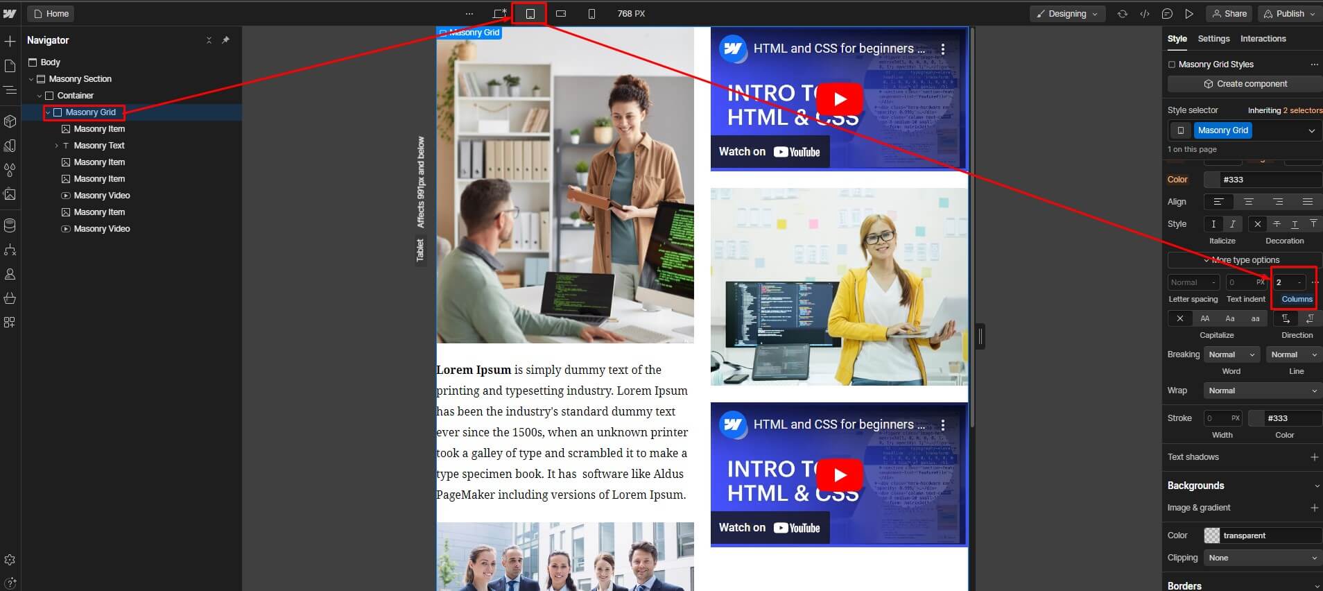
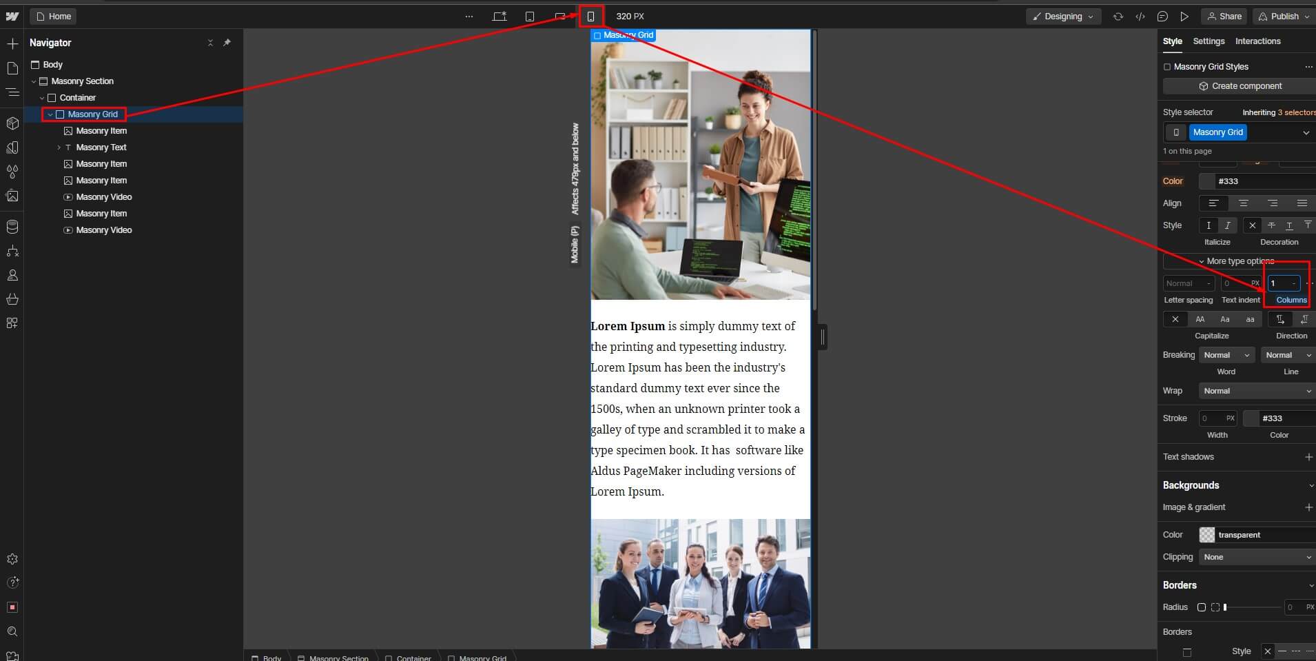
3. You can also use Webflow's responsive breakpoints to fine-tune the layout of your grid for specific screen sizes.
Following these steps enables you to craft visually appealing and responsive masonry grids in Webflow, enhancing your website's design and user experience.
Some best practices for creating masonry grids?
Creating masonry grids effectively requires attention to detail and adherence to best practices. Here are some key guidelines:
Know Your Grid Anatomy: Understand the fundamental structure of your grid, including column width, gutter size, and item heights. This knowledge helps in creating a visually balanced and harmonious layout.
Choose the Right Grid Layout: Opt for an appropriate grid layout based on your content. Webflow Masonry Grids work well for diverse content, but for certain cases, a fixed-height grid might be more suitable. Consider your content type and audience preferences.
Honor Responsive Design: Ensure your masonry grid is responsive, meaning it adjusts seamlessly across various devices and screen sizes. Test the grid layout on different devices to guarantee an optimal user experience.
Make Room for White Space: Embrace white space (empty spaces around elements) to enhance readability and visual appeal. Proper spacing between grid items prevents a cluttered appearance, making it easier for users to focus on the content.
Ensure the Golden Ratio: Consider applying the golden ratio (approximately 1.618) to your grid item sizes. This mathematical proportion often creates aesthetically pleasing designs. Experiment with ratios to find the one that best suits your content and layout.
30+ Top-notch Webflow Templates
Take your website design to the next level with our stunning collection of Webflow templates. making them more manageable
Frequently Asked Questions
Why use a Masonry Grid in your Webflow project?
A Masonry Grid is beneficial for displaying content of varying dimensions, like images, in a visually appealing, flexible, and efficient manner. It eliminates wasted space and enhances user engagement.
How to make a masonry grid responsive?
Ensure a responsive masonry grid by using percentage-based or viewport units for item sizes. Test across different devices and screen sizes, adjusting properties as needed to maintain an optimal layout.
Can I add interactions or animations to Masonry Grid elements?
Yes, you can enhance Masonry Grid elements with interactions and animations in Webflow. Adding special effects can make them more interesting and exciting to use.
Are there advanced techniques for creating Masonry Grids in Webflow?
Advanced techniques may involve integrating custom JavaScript libraries like Masonry.js or Isotope.js for more sophisticated masonry layouts. These libraries offer greater customization and control over grid behavior in Webflow.
List of Top Webflow Templates
Saisio - SaaS Website Template

Your business's online presence is crucial, and Saisio - SaaS Website Template is here to help. This modern website template helps businesses look better in their online presence. It is great for all sizes of businesses. Creating an attractive website is now simpler than ever. You can choose from 23 different pages and sections to make your website look just the way you want it.
Also, with its intuitive interface and seamless functionality, your website will run smoothly. Whether you want to start a blog, create an online store, or showcase your portfolio, Saisio has it all. So, don't settle for a lackluster online presence - choose Saisio for a streamlined and professional website.
Highlighted Features:
- Retina Ready
- 23 Pages
- Webflow CMS
- Responsive Design
- Fully Customized
Price:
Regular License: $49
Lumio - Marketing Website Template

Are you looking for a dynamic, eye-catching marketing website that will make your business apart from your competitors? Look no further than Lumio, a cutting-edge Webflow agency template that offers a range of impressive features.
With its smooth animation interactions, responsive design, and fully customizable graphics, Lumio is the ideal platform for businesses looking to display their products, services, and brands uniquely and engagingly. The template is fully optimized for speed and responsiveness, ensuring your site loads quickly and looks fantastic on any device.
Whether you're a small startup or an established brand looking to revamp your online presence, Lumio is the perfect marketing website template to help you achieve your goals.
Highlighted Features:
- Unique & Premium Design
- Speed Optimized
- Fully Responsive
- Seamless Animations
Price:
Regular License: $49
Novelio - Agency Website Template

Novelio is the perfect solution for IT companies, startups, and tech entrepreneurs who need a cutting-edge Webflow agency template. Its sleek and modern design is fully customizable. It also allows you to showcase your brand in a visually stunning way easily.
But what really sets Novelio apart is its use of Webflow. Webflow is a leading website builder that offers a user-friendly interface and powerful customization capabilities.
With Novelio, you can focus on your core business while still enjoying world-class design and development. This business website template also boasts awesome and creative design, retina-ready capabilities, seamless animations, and Webflow CMS - everything you need to take your digital presence to the next level. Get started with Novelio today and watch your online presence soar!
Highlighted Features:
- Awesome & Creative Design
- Retina Ready
- Seamless Animations
- 24 pages
- Speed Optimized
Price:
Regular License: $49
Xonic - Agency Website Template

In today's digital age, having a strong online presence is key for businesses. Xonic is a sleek and modern agency website template designed to cater specifically to businesses in the marketing, branding, design, and SEO industries.
Xonic is a website template that can help businesses make their services look really cool and special. It has a lot of special features that can help businesses show off their work.
With an impressive selection of 17 static pages at their disposal, businesses enjoy a multitude of choices when collaborating with Xonic, catering to diverse needs and preferences. Whether seeking comprehensive information, specialized services, or specific details, Xonic's array of pages ensures a tailored experience for every client.
Highlighted Features:
- Highly Customizable
- Awesome Design
- Retina Ready
- 17 pages
- Speed Optimized
Price:
Regular License: $79
Bokify - Book Website Template
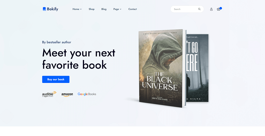
Are you a book lover looking to sell your favorite reads online? Look no further than Bokify, the ultimate book website template. This cutting-edge Webflow template combines elegance and functionality seamlessly, giving you the power to create a stunning eCommerce site that truly reflects your brand.
With extensive customization options, you can tailor Bokify to match your unique vision perfectly. Plus, its responsive design, speed optimization, and cross-browser compatibility ensure a seamless user experience for all. And with scrolling animations that add an extra touch of excitement, Bokify is sure to take your bookselling site to the next level.
Highlighted Features:
- Responsive Design
- Speed Optimized
- Cross-Browser Compatible
- Scrolling Animations
- Interactions & Animations
Price:
Regular License: $79
Hire Developers to Build Your Webflow Website (Recommended: Brandbes)
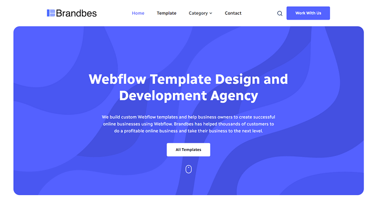
Brandbes is a distinguished Webflow development agency that specializes in crafting tailored templates that cater to your business's unique requirements. Our mission is to empower business owners to succeed in the digital realm by enhancing their online presence and driving increased website traffic and sales through strategic design.
What sets us apart is our team's expertise in creating distinctive Webflow websites that seamlessly align with your needs. We offer a variety of flexible Webflow development plans, including both hourly and monthly options, to accommodate a wide range of requirements. Additionally, our extensive Webflow template library provides you with a diverse selection of templates for your website.
When you choose Brandbes, you're opting for a team of dedicated professionals committed to creating a Webflow website that leaves a lasting impact on your online presence and business success. Elevate your digital footprint with Brandbes and unlock the transformative potential of a thoughtfully designed online platform.
Conclusion
Building a beautiful website might seem overwhelming, especially for those who aren't familiar with coding and web development. Fortunately, Webflow provides an intuitive platform for creating beautiful and functional designs. Create a masonry grid in Webflow that can take your website design to the next level.
This type of grid layout allows for flexibility and creativity in displaying your content. By following a few simple steps, you can easily create a responsive masonry grid Webflow on your Webflow site. With the right design choices and attention to detail, your website is sure to stand out and leave a lasting impression on your visitors.
Reader Disclosure: Some of the posts on our site may contain affiliate links. Clicking may earn us a commission at no extra cost to you. Thank you for your support! Read our Disclosure


