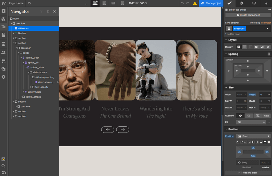
If you’re looking for a way to create an engaging user experience on your Webflow website, you should consider using a carousel. Carousels can display various content, including images, text, and videos. They are a great way to keep your users engaged and help them navigate your website.
In this blog post, we will show you how to create a Webflow carousel. We will also discuss some best practices for using carousels on your website.
Overview of Carousels and Their Benefits
Carousels are rotating software on websites and applications containing images or videos that change periodically. Carousels can provide an element of surprise and draw people in by advertising featured content with a visual punch. They can present multiple pieces of data at once, making them great for quickly showcasing product ranges or giving viewers the freedom to explore different options.

Carousels also offer webmasters the ability to add clicks and motion animation to their site, increasing engagement rates on their homepage and boosting customer satisfaction. Ultimately, carousels are a powerful tool for displaying information in an interactive way, harnessing user attention and compelling more conversions.
When to Use Carousel on a Website
Carousels are dynamic features that can add background images to your website, engaging the viewer by cycling through multiple pieces of content. When used properly, carousels can be effective tools for improving site experience and driving conversions. However, carousels can also overwhelm a site if overused or misused, detracting from important page elements.
When considering whether to use a carousel on amazing Webflow websites, make sure it adds value to both the visual look of the page and its navigation/organization. It should also guide users to take action in an easily digestible way.
Using touches of animation or storytelling in your carousel design can evoke strong emotions and create unique experiences without overloading viewers with too much content. The carousel feature is strategically implemented to capture user attention while providing an easy-to-navigate interface.
30+ Top-notch Webflow Templates
Take your website design to the next level with our stunning collection of Webflow templates.
When to Avoid Carousel on a Website
Carousels may have their merits, but they should be avoided in situations where the user experience is paramount.
- Homepage’s hero section:
When used in the hero section at the top of a website, the carousel can often cause distraction and confusion. People naturally tend to pay attention to moving objects, so multiple items displayed all at once dilutes the user’s focus and may result in them not noticing what’s really important.
Furthermore, deciding how long each item should rotate onscreen can be challenging to make — visitors may experience fatigue if too long. At the same time, a shorter duration might feel too abrupt.
- In articles:
carousel sliders have become increasingly common on websites, particularly with sites that tend to churn out clickbait-style articles. While they can effectively break down content into easily digestible chunks, they should be used cautiously. In particular, carousels should not be used if each article in the series is too long or dense. Furthermore, if users cannot reasonably read through an article within the allotted screen space, then the carousel fails to provide any real benefit and can cause confusion instead.
- When it’s for the company:
The carousel slider of Webflow often appears when developers create a website that prioritizes business interests over that of the user. Carousels are typically requested from stakeholders who have difficulty prioritizing between the needs of their users and those of their company. Therefore, it’s essential to clearly explain why the carousel is being added in order for it to be successful.
If the point for including a carousel only serves to benefit internal metrics such as ad views, then it is unlikely to yield beneficial results. Instead, web developers should strive to find an intersection between user needs and business needs, allowing for a more meaningful product outcome.
How to Create a Webflow Carousel
Creating a Webflow Carousel is surprisingly easy! To get started, click any slide element, and you’ll be taken directly to the Element Settings Panel. From here, simply press the plus sign to add custom fields and additional slides. If two slides simply aren’t enough, then right-click on an existing slide and choose ‘duplicate’ to instantly create a third one. That’s all it takes – before you know it, you’ll have a fully-functioning carousel on your amazing Webflow websites!

Best Practices for Using Carousels on Your Website
Regarding carousel website design, companies can follow a few best practices to ensure their web pages are informative and user-friendly.
- First and foremost, always make sure it’s not autoplay. Autoplay carousels often create confusion, which could result in visitors leaving a page before even looking at the content.
- Additionally, give people control over the slider to control when and how the pictures or information slides change.
- Consequently, use short and clear text on each slide – long paragraphs take away from the effect of a carousel!
- Be sure not to duplicate H1 tags for search engine optimization purposes as well,
- Lastly, test that carousel experience on mobile devices, so it’s touch-friendly.
Following these simple steps will ensure an optimized experience for website users.
Wrap Up
Using a Webflow Carousel is an effective way to improve user experience on any website. A carousel will provide viewers with an eye-catching, yet unobtrusive display of multiple images or content blocks that can easily be cycled through with simple user interaction. Images and content are organized into efficient slides, allowing viewers to access the desired material quickly.
30+ Top-notch Webflow Templates
Take your website design to the next level with our stunning collection of Webflow templates.
Reader Disclosure: Some of the posts on our site may contain affiliate links. Clicking may earn us a commission at no extra cost to you. Thank you for your support! Read our Disclosure


